
Buyers Do Not Ask Neat Keyword Questions
Comparison pages matter in AI answers because buyers rarely ask like spreadsheets. They ask like people who are tired, skeptical, and close to spending money: “Which provider should I choose?” “Is this company better than that one?” “What are the alternatives?” “Who handles this near me without making my life worse?”
That is the uncomfortable part for businesses that only publish broad service pages and cheerful blog posts. AI systems are often asked to compare choices, not recite your About page. If your site does not explain fit, tradeoffs, proof, and alternatives clearly, the answer may be built from someone else’s pages.
Search Engine Journal recently promoted a session on winning more citations in AI answers, focused on measuring AI visibility and prioritizing next steps (https://www.searchenginejournal.com/most-teams-can-measure-ai-visibility-few-can-move-it/588219/). Another Search Engine Journal article reported on a Ten Speed study where product pages earned 24% of observed AI citations in B2B buyer prompts, while Reddit and YouTube were each around 4% (https://www.searchenginejournal.com/product-pages-get-24-of-ai-citations-reddit-youtube-4/587560/). Treat those as market signals, not universal laws. The lesson is still solid: pages close to a buying decision can become source material when they contain clear evidence.
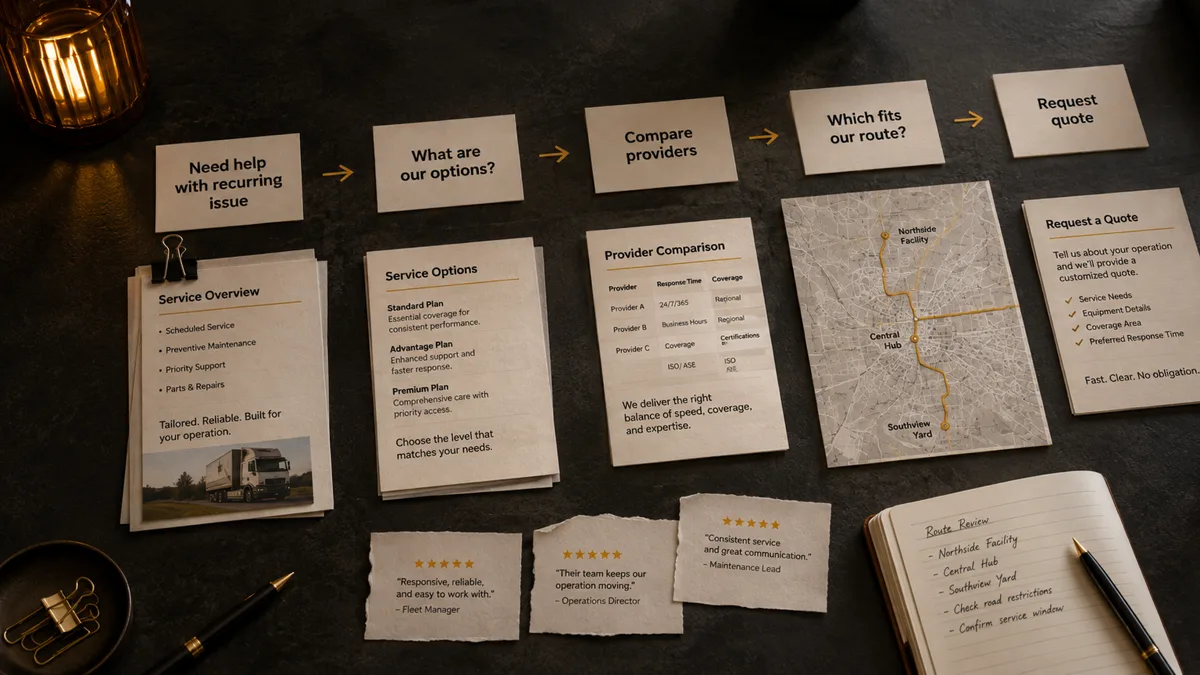
Why Comparison Content Gets Pulled Into Decisions
Traditional SEO often trains businesses to think in isolated keywords. That still has value. But AI-shaped search turns one messy buyer question into smaller jobs: understand the problem, identify options, compare providers, check trust, reduce risk, and choose the next step.
A comparison page can support several of those jobs at once. It can define the category, explain fit, name tradeoffs, answer objections, and point the customer toward a practical decision. That makes it more useful than a generic “best provider” post that ranks ten companies with suspicious enthusiasm and the publisher mysteriously at number one.
Not every business needs a giant “us versus everyone” library. Many do not. But buyers already compare. If your site refuses to help them compare honestly, they will ask Google, ChatGPT, Perplexity, Gemini, review sites, forums, and friends with strong opinions and questionable Wi-Fi.
Google’s guidance for AI features says ordinary SEO practices and standard Search controls apply to AI Overviews and AI Mode, with no extra technical requirements that guarantee inclusion (https://developers.google.com/search/docs/appearance/ai-features). In plain English: the work is still accessible, useful, trustworthy information. Comparison content is not a loophole. It is a way to answer a real buyer task.
What an Honest Comparison Page Should Do
A useful comparison page starts by naming the decision. Do not make the reader decode what is being compared. If the page is about SEO versus ads, say that. If it is your service versus a DIY tool, say that. If it is your company versus a known alternative, be precise and fair.
Then explain fit. Good comparison content helps the buyer see which option makes sense for their situation, budget, timeline, risk tolerance, and workload. A local service company does not need the same visibility system as a national SaaS brand. A startup with no proof problem needs different work than a mature business losing branded searches to review sites and competitors.
The strongest pages include tradeoffs without acting allergic to them. If your option is better for hands-off implementation but costs more than DIY, say so. If a competitor is better for enterprise reporting but weaker for owner-led local service businesses, say that carefully and support it. If paid ads are faster but organic visibility can compound, explain the time horizon instead of pretending one tactic was blessed by marketing angels.

The Evidence AI Systems and Buyers Need
AI visibility is not about tricking ChatGPT. It is about making your business retrievable, understandable, trusted, cited, and recommended across the places AI systems use to form answers. Comparison pages help when they package evidence around a decision, not when they spray keywords across a page and hope the robots feel inspired.
Start with business facts: services, locations, customer types, pricing model when appropriate, process, timeline, credentials, and support boundaries. Then add proof: reviews, examples, case evidence, implementation notes, third-party mentions, and visible customer outcomes. Finally, add decision logic: who should choose each option, what risks to consider, what questions to ask before buying, and what the next step should be.
Google’s Search Essentials still emphasize access, indexing, usefulness, and avoiding deceptive tactics (https://developers.google.com/search/docs/essentials). Google’s helpful content guidance points toward content made for people and built to satisfy the visitor’s task (https://developers.google.com/search/docs/fundamentals/creating-helpful-content). That is painfully practical advice. Almost rude in its lack of secret hacks.
Structured data can support clarity when it matches visible content. Schema.org’s Organization and Service vocabulary can describe business and service entities (https://schema.org/Organization, https://schema.org/Service). Helpful? Yes. Magic? No. Schema cannot make a biased comparison feel trustworthy, and it cannot turn thin claims into evidence.
Where Comparison Pages Go Wrong
The first mistake is fake neutrality. If your company publishes “Best Options for X” and ranks itself first without transparent criteria, third-party evidence, or a clear disclosure, readers notice. So do reviewers. So, increasingly, do systems trained to prefer useful source material over self-serving fluff with a blazer on.
The second mistake is writing attack pages. A comparison page should help the buyer choose, not throw tomatoes at competitors. Be firm about differences, but keep the tone useful. If you cannot explain your advantage without sounding like a comments section, the page is not ready.
The third mistake is comparing features while ignoring owner outcomes. A business owner cares whether the choice will produce more qualified leads, reduce wasted spend, save time, protect reputation, or make marketing less confusing. Technical differences only matter when they connect to those outcomes.
The fourth mistake is burying the answer. If the page makes people scroll through 900 words before learning who each option fits, it is not comparison content. It is suspense fiction for someone with a credit card open.

A Practical Comparison Page Framework
Use this structure when a buyer genuinely needs help choosing between approaches, vendors, tools, or service models.
- Name the exact decision in the opening section.
- Give the short answer first: which option fits which buyer.
- Define the comparison criteria before making claims.
- Explain strengths, weaknesses, and tradeoffs for each option.
- Support claims with visible proof, examples, documentation, reviews, or first-party experience.
- Include “not a fit” guidance so the page earns trust instead of chasing everyone.
- Link internally to service pages, case evidence, pricing context, FAQs, and related guides.
- End with a practical next step that helps the buyer move forward.
That last point matters. A page can get mentioned in AI answers and still fail the business if the next step is vague. Visibility without conversion is just awareness doing laps.
How to Decide Whether You Need One
Not every comparison deserves a new URL. Some belong as sections on a service page, FAQ, pricing page, or sales enablement asset. Create a dedicated page only when the question is common, commercially meaningful, distinct from existing content, and useful enough to stand on its own.
A dedicated comparison page usually makes sense when customers regularly ask the question before buying, the decision affects revenue, competitors or directories already control the narrative, or AI answers are summarizing the category without your facts. It also makes sense when the comparison can be handled honestly. If the page needs fake methodology to justify itself, do not publish it.
For Nugentive’s work, this sits inside the larger AI visibility system: crawler access, entity clarity, helpful content, proof, source consistency, technical health, and conversion paths. A comparison page is one evidence asset, not a miracle machine.
The Bottom Line
Comparison pages can help AI answers and human buyers because they match how decisions actually happen. Buyers compare options. AI systems summarize options. Your business either contributes clear, trustworthy evidence to that process or lets other sources define the choice.
The win is not “we published a comparison page.” The win is that a rushed, skeptical customer can understand where you fit, why you are credible, and what to do next. If AI systems can extract that same clarity, even better.
A paid AI Visibility Audit can identify which comparison, service, proof, and technical gaps are most likely to cost you customers. Because guessing which page to write next is technically a strategy. It is just not a very good one.